Landing Page Mistakes You Will Never Make Again

Ok, first, let’s be clear about what a landing page is. It’s not your home page, or even your product or service page. It’s a page on your site which is specifically designed to do one thing and do it well – convert your visitors into leads or sales.
And a few simple tweaks to your landing pages, can see your conversion rate increase by 100%, 200%, 300% plus. Without having to spend a single penny on more traffic.
So if you’re struggling with low conversion rates on your landing pages, then you’re probably making at least one of these landing page mistakes.
Slow page load times
I’ve put this at the top because, in my opinion, it’s one of the biggest killers of conversions rates. People just don’t have the time or patience to wait around whilst you’re web page loads. They will just bounce.
Do yourself a favour and test the page load time of your landing pages before you start sending traffic to them.
The also applies to any page on your website.
Here’s a couple of tools we use to test page load times:
https://gtmetrix.com/
https://developers.google.com/speed/pagespeed/insights/
One of the biggest causes of slow page load times we come across is cheap, slow hosting. Using fast web hosting is a must if you want to get the best performance from your landing pages.
Unfocused content
Your landing page needs to be highly relevant to your ad. You wouldn’t believe how many audits I do and see multiple, different targeted ad groups, sending traffic to the same page. Worse still, the home page.
Your landing page needs to be highly relevant to the ad the visitor clicked on. If it’s not, you will confuse them and they will more than likely bounce.
Don’t make your visitor think “am I in the right place?” Create laser-focused content from the headline, down to the footer.
Bad Colour Combinations & Font Sizes
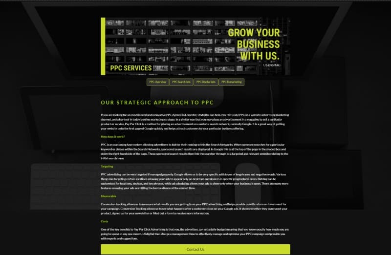
Ok, font and background colours are a bit of pet peeve with me. I hate reading web pages that use lots of white text on a black background. Try reading the content yourself, switch back to google and watch the effect it has on your eyes.
Combine that with tiny font sizes and you’ll be giving your prospects a migraine instead of persuading them to get in touch or buy one of your products.

Too short or too long
You can find case studies proving and dismissing almost everything on the Internet. I’ve read studies that confirm long-form landing pages are best, and I’ve read studies saying the exact opposite.
Confusing isn’t it?
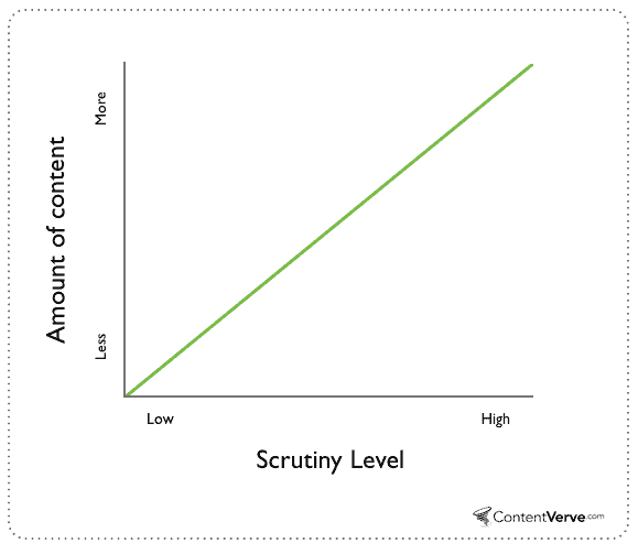
The truth is this: if prospects are sceptical about your business or product, your landing page needs more words. If you’ve branded your business well and prospects know you deliver quality, less content on your landing page is required.
Content Verve found that the more scrutiny a product was under, the more copy it required to convince prospects:

How do prospects feel about your business and products? Add more content to your landing page if they have doubts, or take bits out if they almost never need convincing.
Pro-tip: If you have prospects who fall on both sides of the argument, create two unique landing pages and drive new website visitors to the long-form page, and returning visitors to the short-form.
Not split-testing
No sane individual enjoys testing landing pages, it’s a very tedious and boring process. But if you’re serious about generating more leads online, you must test your copy.
KISSmetrics have a great article that shows 100 different examples of businesses who ran simple A/B tests on their landing pages and saw dramatic increases in opt-ins.
Testing a landing page is not writing two copies and seeing which converts the best, it’s about understanding data and making educated decisions to find potential bottlenecks on your page.
For example, Google Analytics may reveal that the average website visitor spends 3 seconds on your landing page, this is a red flag that either:
1. Your headline is not engaging enough
2. Your ad was not relevant to the landing page
3. You’re targeting the wrong people
Perhaps a heatmap tool shows that nobody is engaging with your call-to-action, this could mean that it’s:
1. Not in a prominent position
2. Colour is not engaging
3. it’s too small or not in direct view
With this data you can then begin to test elements of your landing page to further optimise. Just guessing what the problem may be without using data is like looking for a needle in a haystack.
Summary
A landing page is the entry point for prospects to enter your sales funnel. You don’t have to spend hundreds of pounds hiring copywriters or need to buy expensive testing software, simply addressing the issues above can see your landing page produce more leads or sales than you know what to do with.
